Meet the new Dovetail: updated navigation, features, and logo
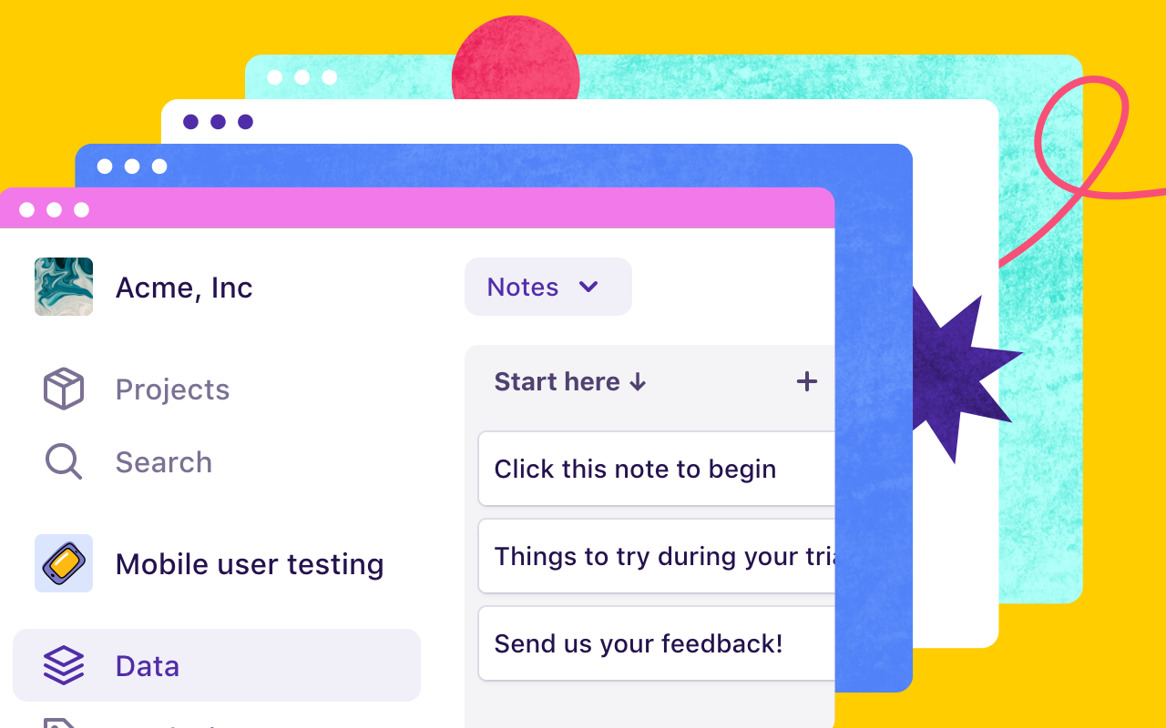
Today we’re launching some new stuff. The most noticeable is a new sidebar navigation and updated terminology to make Dovetail more intuitive, along with a few new features like project categories and templates.
We’re also changing our logo. Read on to learn more!
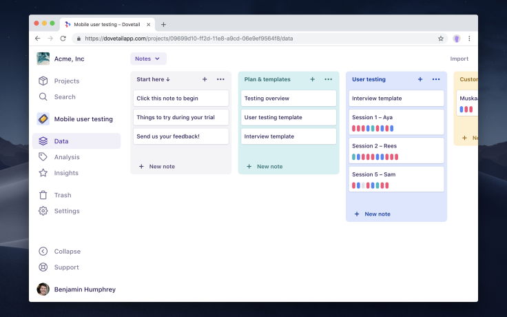
Our new sidebar is available across all pages which makes it easier to move around quickly. Every action now has a label, instead of just an icon, which makes Dovetail easier to use. And if you prefer more horizontal screen real estate, then the sidebar can also be collapsed.
We noticed a lot of new users were struggling with abstract terms like teams, members, notes, and tags. To address this we’ve renamed a few things with more meaningful language, and we have modified our information architecture so projects are more self-explanatory.
Here’s what we’ve changed:
Team becomes Workspace – A collection of users and projects.
Member becomes User – A person who has access to the workspace.
Here are some new terms we’ve introduced:
Data – raw research data including notes, images, audio, video, etc.
Analysis – this is where you’ll find your tags, insights, and charts.
New features
Project templates
We’ve released a new templates feature that lets you create and manage shared project templates for the rest of your workspace to use when starting a new project. Templates are great if you want to re-use a set of tags between projects, or standardize your project structure!
Project categories
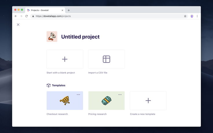
You can now organize projects into categories on the projects screen with drag and drop reordering. This is very useful if you have lots of projects and need to organize them by team, department, method, or status.
Project and workspace icons
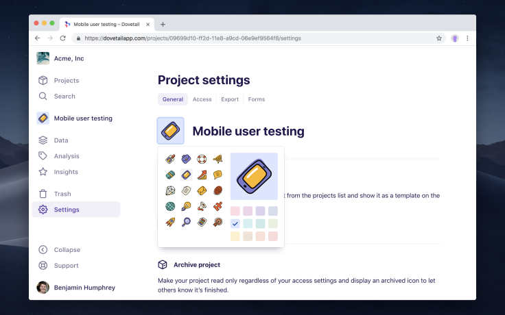
Personalize your projects with one of 20 colorful icons, and brand your workspace by uploading your company logo and setting the name.
Trash
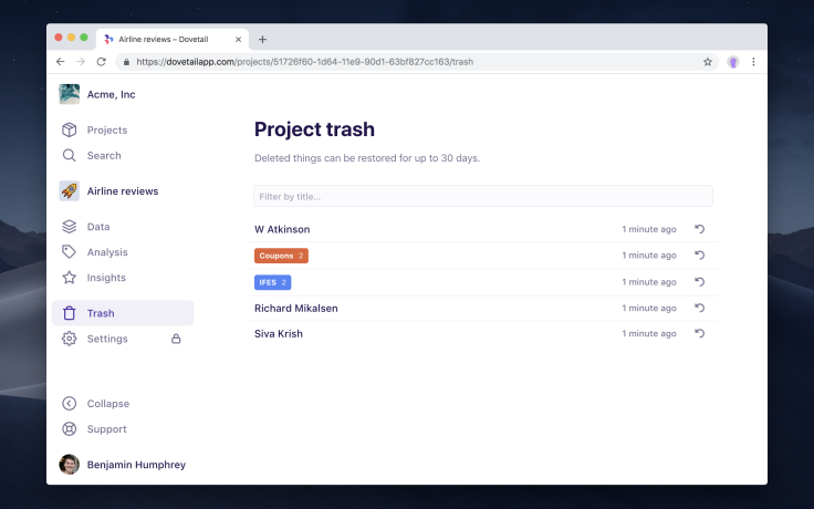
Accidentally deleted something? Now you can restore anything you delete for up to 30 days in the workspace or project trash.
Dark mode
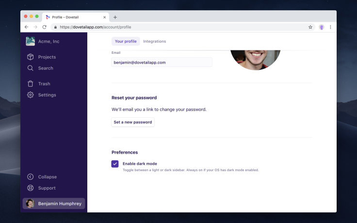
Night owl? You can now toggle dark mode in your user profile. If you’re using a browser that supports OS-level dark mode, then you’ll find it’s enabled automatically based on your OS setting.
Settings screens
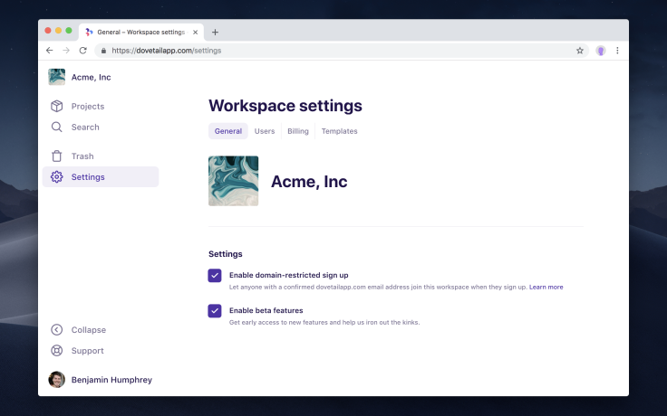
Our menus were getting overloaded so we’ve moved some actions into two settings screens – one for the workspace which contains users, billing, and templates, and one for projects which has project actions to archive, delete, manage access, export, and more.
Transfer admin
Workspace administrators can now transfer the admin to someone else in the workspace without needing to contact us.
New logo
We did like our old logo, however it had a few issues: the bird metaphor wasn’t related to our product, it was difficult to draw, didn’t fill a square, and the all-lowercase wordmark introduced ambiguity around capitalization. Is it “dovetail”, “Dovetail”, or heaven-forbid, “DoveTail”?
We worked with Sydney-based designer Alfred Salib to come up with a new metaphor and logo for Dovetail. We feel our new logo better represents our product (the unification and storage of different data), it’s much easier to draw, is a bit colorful, looks great on dark and light backgrounds, fills a square, and clearly shows how to capitalize our name (it’s “Dovetail”).
Coming soon
Highlighting improvements (in beta now)
We are working on a new highlighting interface and some technical changes to address longstanding usability pain points with highlighting. You can try it out now by enabling beta features for your workspace.
New insights (February)
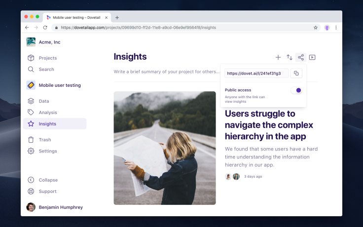
We’ve been listening to all of your feedback about insights over the past 12 months, with the main point being that they’re confusingly similar to tags.
We agree. We’re working on a completely new experience for insights that will be distinctly different from tags. This new feature will focus on helping you summarize and share your research findings. You’ll no longer be able to highlight with insights – instead there will be a better way of creating insights and referencing data in your project than highlighting.
When the time comes, everyone will get to decide whether they want to migrate existing insights to our new insights, or to tags, on a per-project basis. Stay tuned for more information over the coming weeks!
Further navigation improvements (March)
We still have some work to do on navigation. We will be making it easier to navigate quickly between notes or tags within a project, and we’ll improve our new navigation on mobile.
Transition process
Availability
The new navigation and new features listed above are available by default for everyone right now. You don’t have to do anything except log in!
If you’d like to try out our new highlighting interface, all you need to do is enable beta features for your workspace and refresh. We’re hoping that our new insights feature will be available in beta in early February 2019.
Documentation
Most of our help documentation has been updated to reflect the new navigation and terminology, and we’ve also improved the look of articles in general. We’ll continue improving our docs over the coming weeks.


