Visualize your user research with our new pie chart, treemap, and radar chart!

Visualize your research project with 24 new, unique combinations of charts with a new pie chart, treemap, and radar chart. Get a quick overview of your projects’ tag groups, tags, and highlights, and take a few screenshots of beautiful charts for your presentation.
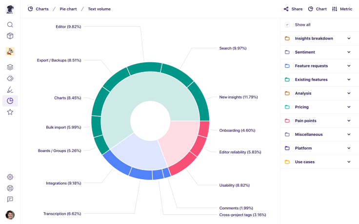
Pie chart

A pie chart has been a popular request! See a pie chart of your tags or a roll-up of tag groups across three different metrics: highlight count, note count, and tagged text volume.
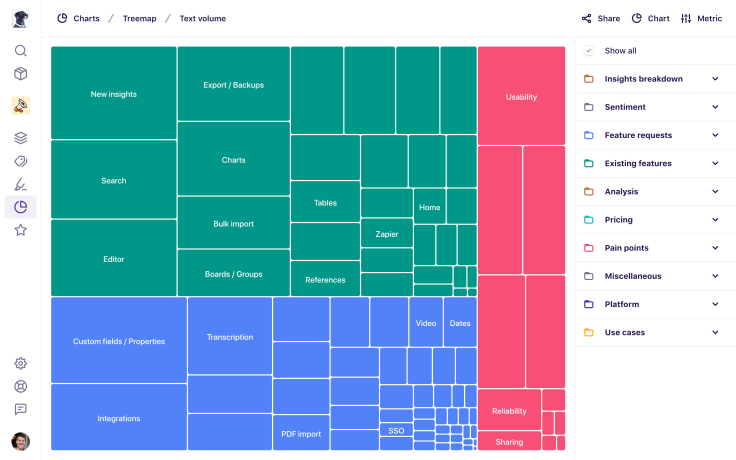
Treemap

Looking for a different way to visualize your data? The treemap gives you a colorful and space-efficient way to compare values for one of the following metrics: highlight count, note count, and tagged text volume.
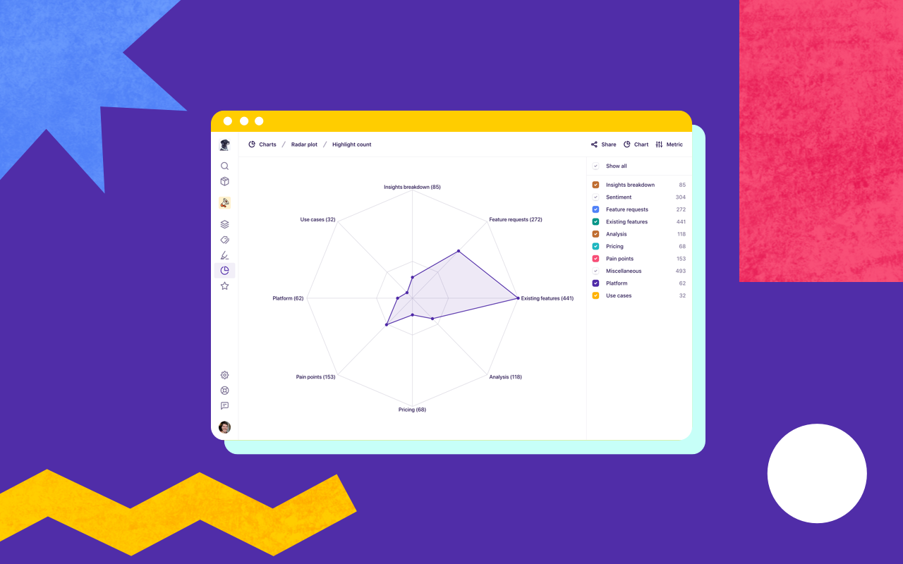
Radar chart

The radar chart gives you yet another way to compare values for one of the following metrics: highlight count, note count, and tagged text volume. It’s a bit of an experiment so we’d love to hear your feedback.
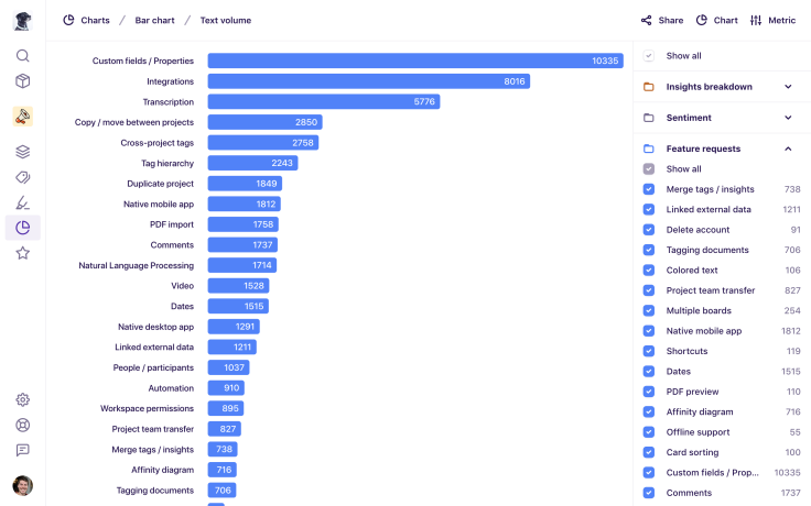
Bar chart

Like all of the charts above, the bar chart lets you compare the following metrics: highlight count, note count, and tagged text volume.
Other improvements
We’ve also made several other improvements to our charts feature:
Added values to the legend.
Added hover tooltips to all charts.
Added animations to all charts.
Added breadcrumbs to act as the chart title.
Updated the behavior so all items are selected by default.
Improved the usability of the filter legend including ‘Show all’ checkboxes.
Improved accessibility and keyboard interaction of the filter legend.
Improved the layout for charts on mobile devices.
Improved cross-browser compatibility of charts.
Try it out
Just click Charts in the sidebar, then click Chart in the top right to choose a new chart. To change the metric, click Metric in the top right and choose a new metric.
For more information on charts, check out our help article, and feel free to send us your feedback by clicking Support, then Feedback!


