A guide to running unmoderated usability tests

Usability tests aren’t the sexiest part of user research, but regularly conducting them can be a strong signal of a healthy product development process. This article will help you get from burning questions about your product to sharing actionable insights with your whole team.
Structure the test with research questions
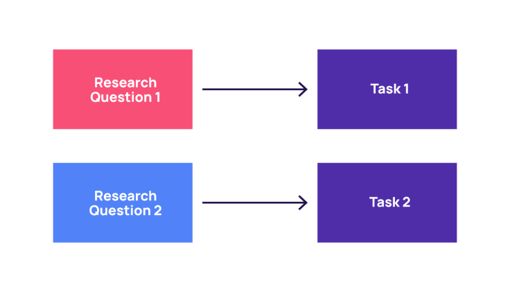
There’s no real point running a usability test unless you know what you should be testing. A research plan is useful for designing the usability test, picking the research questions, and figuring out how to use those questions as your test’s backbone. Essentially, one research question should equate to one task.

Let’s say that we’re an adblocking company trying to find out how our customers use our ‘block element’ feature. The product manager wants to know: Do users manage to block specific elements on a website using our feature? And if they’re going to revert their action, can they do so easily? We now have the two tasks that we will complement with follow up questions.
Let the participant do (most of) the work
If you’ve decided to use the research methodology of unmoderated usability testing, chances are your main priority is the speed at which you can get to the insights phase. The last thing you want to do is spend hours sifting through videos and documenting related notes. Alternatively, asking the participants to capture their impressions is an excellent way to save time.
Using the same ad blocking example, you should structure the questions in the following flow:
The participant performs the task and comments out loud: You’re annoyed by the Marketplace images on Facebook. Show us how you’d block those images using your adblocker.
The participant provides a written rating of their experience of the task: On a scale of one to five, how easy was it to block the Facebook Marketplace images? One indicates very difficult, and five indicates very easy.
The participant provides a written explanation of the rating they indicated: Can you explain why you chose the rating you did? Please be as specific as possible.
By designing the test in this way, it should be easy to understand what worked and what didn’t by merely skimming through the participant notes on your usability testing platform. The next essential step is to verify that the participants’ notes line up with their behaviors. You can do this by jumping through the videos to identify any apparent contradictions.
Be as clear as possible
One of the significant differences between moderated and unmoderated usability tests is how the participant engages. In an unmoderated usability test, the participant only interacts with the prototype and not with a moderator. They don’t feel like they have anything to prove to a moderator, and they’re less likely to seek clarification when faced with ambiguous instructions. They don’t focus on whether they interpret the question correctly or not, often answering as quickly as possible. Because the participant is only interacting with the prototype, there isn’t the opportunity for a moderator to ask any follow-up questions. Therefore, for the sake of clarity, you should:
Give one instruction per sentence
What not to do:
Show us how you would prevent those pictures from showing and click on complete once you are done.
What to do:
Show us how you would prevent those pictures from showing. Click on complete once you are done.
Avoid blocks of texts
If you need to add context or a scenario, avoid blocks and start new paragraphs whenever appropriate.
What not to do:
Now let's imagine you are on Facebook. On the right side, there are pictures of the listings you recently looked at on the Facebook Marketplace. You are annoyed by them and wish they didn't appear anymore. You remember that your adblocker has a feature that enables you to block elements on a page. Show us how you would prevent those pictures from showing. Click on complete once you are done.
What to do:
Now let's imagine you are on Facebook. On the right side, there are pictures of the listings you recently looked at on the Facebook Marketplace. You are annoyed by them and wish they didn't appear anymore.
You remember that your adblocker has a feature that enables you to block elements on a page.
Show us how you would prevent those pictures from showing. Click on complete once you are done.
If you have doubts about wording, ask a couple of colleagues (native speakers are particularly helpful ).
Always do a dry run before you launch
Before launching, you should go through each step of your test as if you were the participant. Most usability testing software should have a feature allowing this. Look out for spelling or grammatical errors, confusing instructions, or incorrect ordering of questions. Even after a thorough review (possibly by a fellow UX researcher or a member of your product team), it’s impossible to be certain that your test will run smoothly. The only way to truly find out is to put your test out in the world and observe how one or two participants manage it. After real-life confirmation that everything works, you should feel confident to launch the test with the required number of participants. After this, you can rest easy knowing the results are accumulating.


